Design Process
Setting Standards as a Design Team
How we guarantee consistency and efficiency throughout our designs

Rob Scholten
Aug 1, 2020
It’s more than often that we work on the same project, as a team. That comes with a lot advantages over someone working alone. But if we would all design from our gut feeling without a clear set of standards or foundations this will manifest itself in chaos, inconsistency and loss of quality.
It’s like building a spaceship while everyone on the team uses different measurements. When stuck together, it would probably look like a spaceship, but it would never take off.
As a team, we strive to deliver high quality, which is also in the details. We believe we can guarantee this quality with standards. These standards make sure our team is always on the same level when it comes to designing and collaborating. It helps us to design and structure our files consistently, which makes working together on the same project much more productive.
These standards should be well documented so they are easy to adopt. Unlike a traditional design system our way of working must be adaptable across a wide array of projects and leave room for creativity.
Without proper guides, we feel a disconnect in our digital product team. For ourselves, we’ve set up our guidelines for Figma, but in its core, it should apply to any design team and any design tool.
Our standards
Pages & Artboards
Let’s start at the very beginning of a project. Setting up our files and artboards. All our files can be found within the tool we use for design, it is therefore not necessary to create our own (local) folder structure.
Figma uses the following layering: Team account / Project / File. To keep things organised we create a unique file for every project phase. this way we keep everything structured and easy to find. The autosave option makes it possible to work with a single central file, as we can always access its version history.
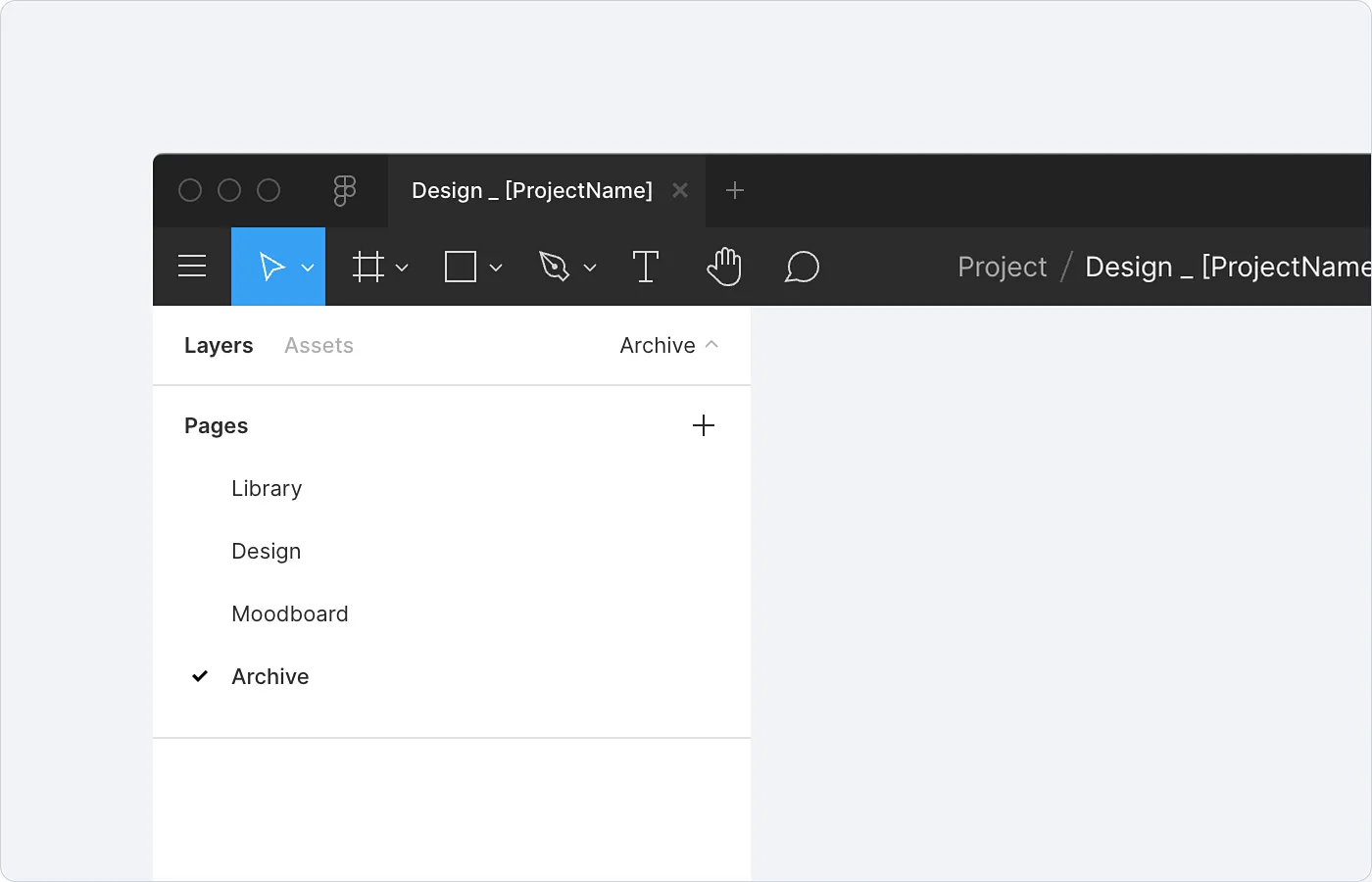
How we organise our workspace
The ‘Library’ is where everything style-related goes (e.g. components, colours). The actual designs are put on the design page. But when the product has a lot of different flows we divide it up using additional pages (e.g. ‘Dashboard’ or ‘Registration’) for a better overview. Our inspiration is gathered under ‘Moodboard’. And finally, our experiments, (not chosen) alternatives and previous iterations are put in the ‘Archive’.
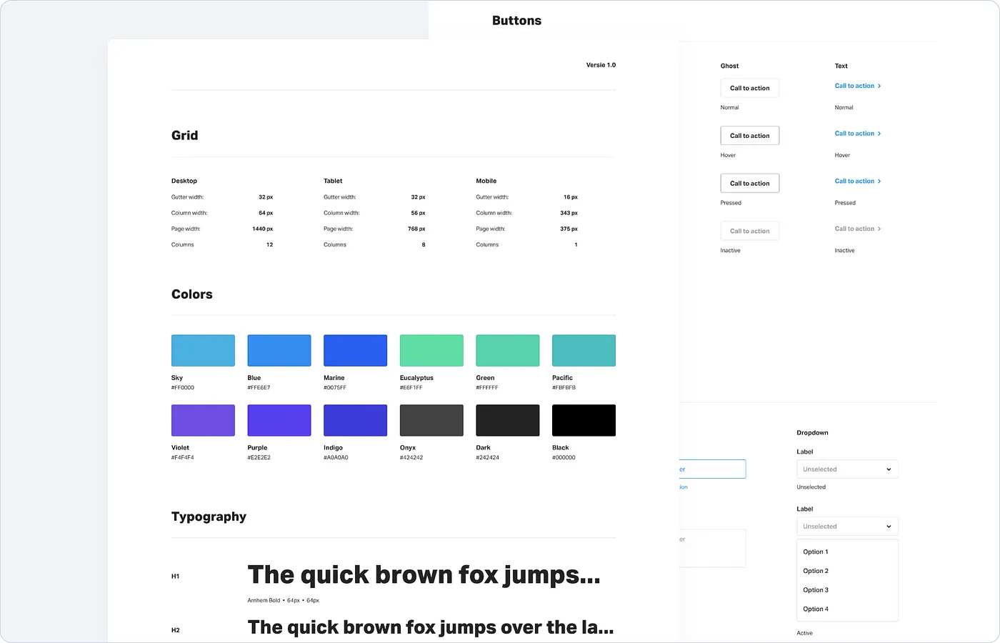
Grids
As a designer, you’ve probably heard of grids. They are not only used for digital design work, but also for print like magazines and newspapers. A grid is a way to structure content through intersecting lines. It serves as a reference on which the designer can place its elements.
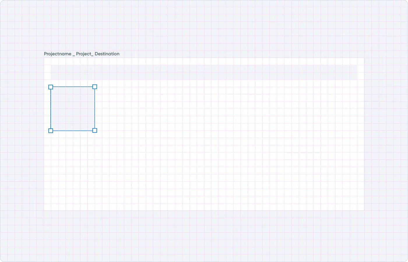
Example of how to make use of a grid
Using a grid makes it easy to create and organise your design. Designing without it won’t be immediately noticeable on a single element, but when you see multiple elements together you’ll definitely be aware there is no visual system and no consistency. This would be even more apparent when designing together in a team, the grid provides less options for placing elements.
We make use of the 8 point grid system. The grid uses increments of 8 to size and space out the elements on a page. This means that any defined height or width, margin or padding will be an increment of 8.
For the 8 point grid system there are actually two methods you can adopt. We make use of the soft grid method, but it is also possible to use the hard grid method. This basically describes how strictly we adhere to them. Using the hard grid means that every single element, even typography has to be spaced, sized and placed perfectly using increments of 8 without any exceptions. But this is hard and illogical to replicate while developing, so we decided not to bother. This means we only use these increments for spacing.
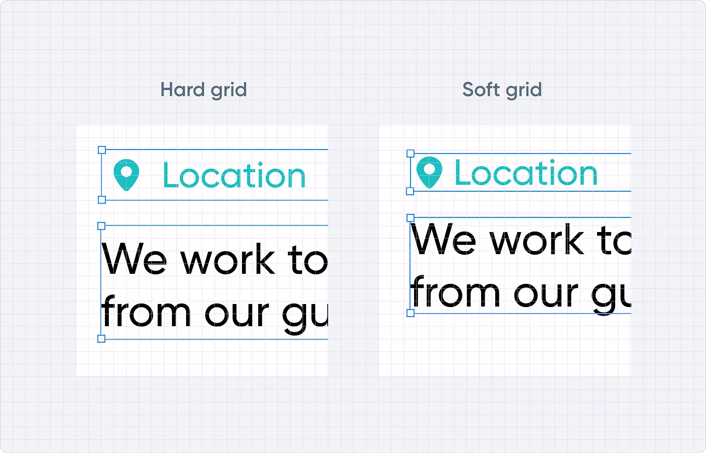
Difference between soft and hard grids
When it comes to making layouts responsive, we use a column grid. The layout grid adapts to screen sizes and orientations, ensuring consistency across layouts. These layout grids are made up of three elements: columns (magenta), gutters (green), and margins (blue). Our column and gutters are set to be dividable by 8.
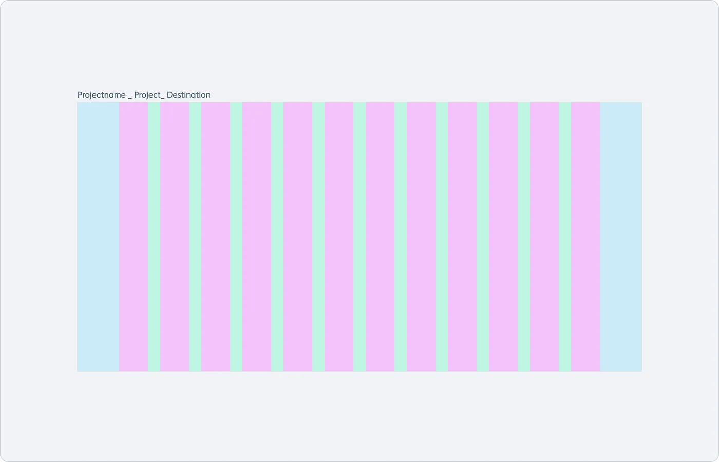
Using a responsive layout grid
While designing we target desktop as well as tablet and mobile devices. We adjust the number of columns for each of these devices to ensure that elements won’t get too small. Most of the time we use 12 columns for desktop. For tablet we often take half of that (yep, that’s 6 indeed). For mobile we use both 1 and 2 column grids.
We’re rooting for grids (and developers are with us), but sometimes we choose to ignore our own guideline. If something in your design works better but doesn’t fit the grid, just switch off the grid for a second. That’s why they’re called guidelines instead of rules anyways.
Naming conventions
It’s also important to agree on how to name things. Because let’s face it. It’s quite hard to discuss topics with people that don’t speak the same language. To some extent, this also applies to your design components. Using naming conventions will reduce the effort needed to read and understand. it’s important that everyone can find the right items quickly and easily. To simply put it, that everyone has a common language.
We make use of Camel Case. Words created by concatenating capitalised words. We make use of Camel Casing because it’s better scannable when used e.g. within a sidebar. When space is needed between words we use an ‘underscore’. When naming elements, consider using HTML semantics (e.g H1, img and button).
Library
Style guide
The style guide is a set of comprehensive documentation that communicates the design practices.
Style guide example
In our style guides we cover the following:
Typography
Colors
Effects
Iconography
Components
Smart Styling
To keep the use of typography, colours and effects (e.g. box-shadows) consistent we make use of smart styles. These styles allow us to define a set of properties for an object, that can be reused across our design team. Whenever there is a change to a Style’s properties, it will be automatically applied to all objects using that Style.
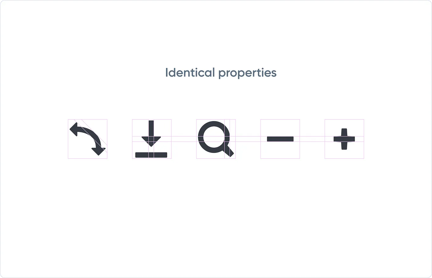
Iconography
Icons are a visual representation of the textual meaning. In design, icons are used to increase the utility of the product, ultimately by making things simpler for the user. When creating icons, the real challenge lies in making them commonly understood. This reduces the amount of learning required to use our products effectively.
As mentioned before, we focus on function over form. But remember, aesthetics do matter. The properties that are shared across an icon set are what we call the aesthetic unity. These properties are things like rounded or square corners, the specific size of corners (e.g. 2pt, 3pt, etc.), line weights (e.g. 2pt, 3pt, etc.) and style (e.g. flat, line, filled line or glyph).
An aesthetic iconography unity
Components
Our library consist of reusable design elements called components. Anything in the UI that groups at least a few elements can be called a component. The most traditional examples are cards and navigations. This way the components in our project are reusable, scalable and maintainable. This can save a lot of time by focusing on function over form.
Conclusion
Nowadays, since the introduction of our design standards discussions are almost only about the user experience, and hardly any more about the aesthetics. This gives us as a team more space and time to improve the product.
These standards also provide us with a structured way of working. We believe that setting up guides is essential to keep the product your working on consistent and recognisable. Although, you should always keep in mind to leave room for creativity. When you’re also planning setting up design standards for you team (or for yourself), I suggest spending the time and resources to get it right.